SuperTasks
A keyboard-first Mac task manager with no account, no subscription, and no cloud — sold on everything it deliberately doesn't do.
Visit the sitePlatform
macOS 12+, Apple Silicon
Account required
None, ever
Download
~25 MB, free
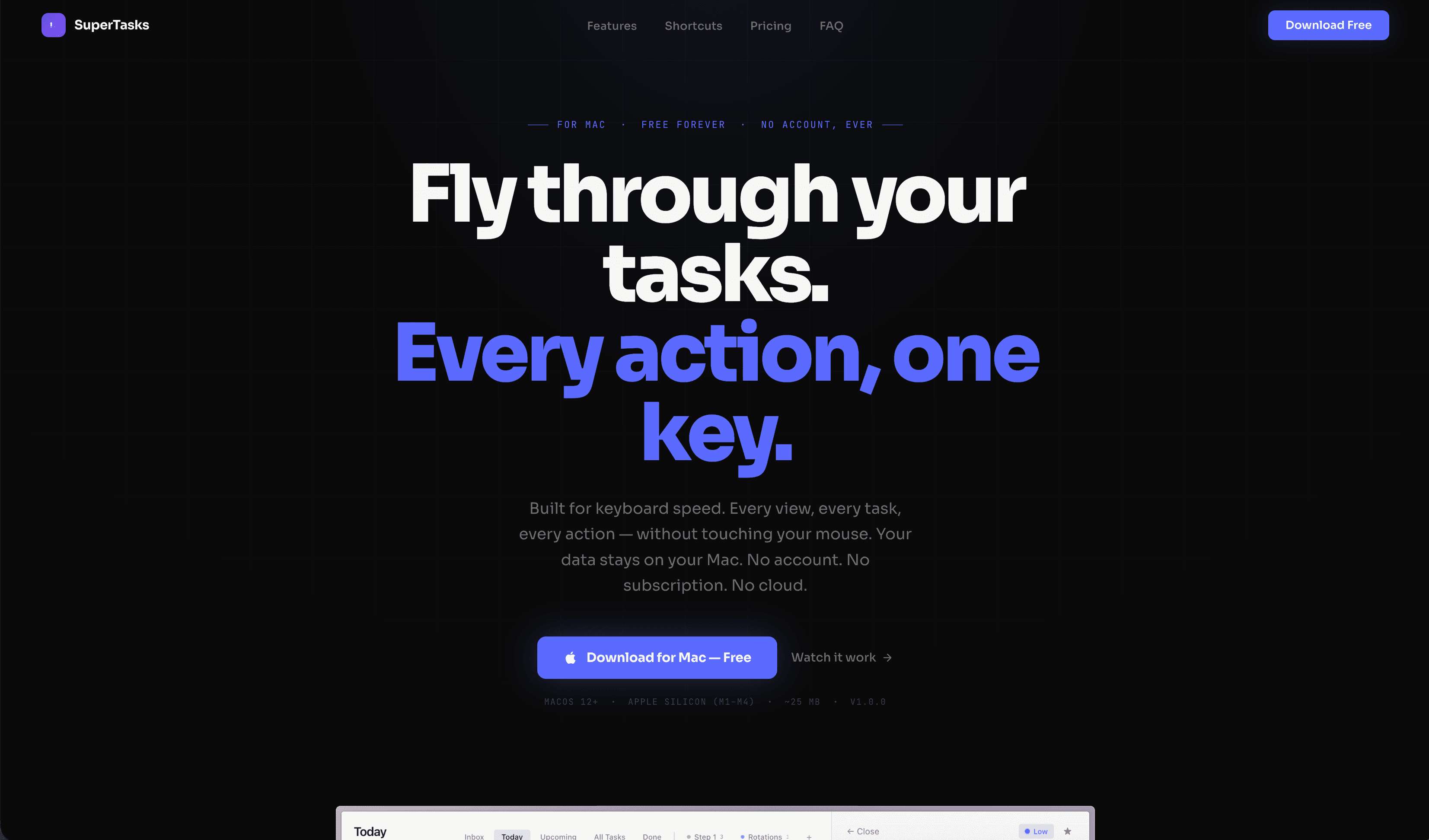
The launch site
The Problem
Nobody needs another to-do app.
It is the most crowded category in consumer software, and the person most likely to download a new one has already abandoned four. They are not looking for more features. They left the last app because it wanted an account, or started charging monthly, or moved their data to a server.
A feature list can't win that person. Every competitor has the features, and the good ones have more.
What that person actually wants is a short list of promises about what the software will never do to them — which is an odd thing to build a homepage around, because it means leading with absences.
The Approach
Put the absences above the headline.
The first line on the page isn't the headline. It is For Mac · Free forever · No account, ever, set small in mono and spaced out like a spec stamp. Three qualifications, in the order that decides whether the rest of the page is worth reading.
Then the promise, in type big enough to be the product itself: Fly through your tasks. Every action, one key. The second half turns indigo, because that half is the actual differentiator — speed by keyboard, not another view.
And under the download button, a line most marketing sites would cut: macOS 12+, Apple Silicon, ~25 MB, v1.0.0. To this audience that reads as respect. It says the thing is small, finished, and made by someone who assumes you know what a version number means.
The Mechanic
You can't screenshot “fast.”
Speed is the entire pitch, and it is the one claim a static page is worst at making. A list of shortcuts is a list of homework. A video is someone else being fast.
The only honest demonstration is to hand over the keyboard — so the case study does. Click the panel and drive it: J and K to move, X to complete, S to star, D to delete.
Four keystrokes in, your hand hasn't moved. That feeling is the product, and it takes about six seconds to transmit.
- Draft the Q3 board update
- Review Alvarez chart notes
- Ship the pricing page copy
- ✓Call the venue about parking
- Renew the malpractice policy
Click the panel, then use your keyboard
The Download Decision
Four fears, answered before the button.
A download is a small commitment with a long tail — installs, accounts, data, subscriptions. Every one of those doubts gets its answer above the fold, which is why the page can afford to be this short.
Do I have to make an account?
No account, ever — in the eyebrow, above the headline
Is this going to become a subscription?
Free forever, stated twice before the button
Where does my data go?
Your data stays on your Mac. No cloud.
Will it run on my machine?
macOS 12+ · Apple Silicon (M1–M4) · ~25 MB · v1.0.0
The System
Two typefaces, doing opposite jobs.
A heavy grotesque carries the headline at a size that reads as confidence rather than volume — and it splits across two colors so the differentiator is legible even to someone scrolling past.
Everything technical is set in mono: the eyebrow, the system requirements, the shortcut keys. That contrast is the whole identity. Mono says specification, and specification is what this audience trusts. Indigo appears only on the thing you press and the row you have selected — the same rule in the app and on the page.
Black
#0A0A0A
Page ground
Indigo
#5B6AFF
Headline half, actions, selection
Violet
#7753ED
App mark
White
#F5F5F5
Display type
Gray
#717171
Body copy
Panel
#1A1A20
App surface
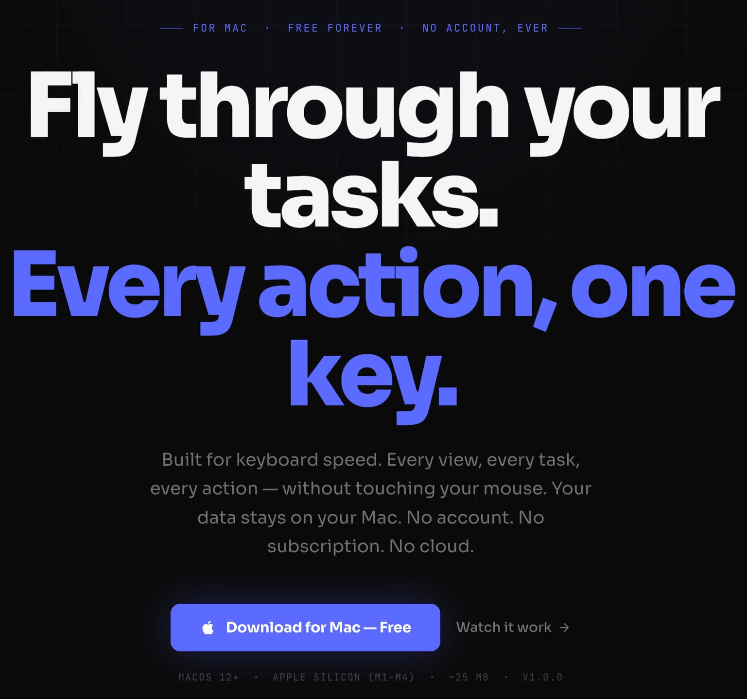
Spec stamp, promise, absences, download, requirements
What Was Built
A short page for a short decision.
One screen to decide, one button to act, and the technical detail a power user checks before installing anything — nothing else competing for the scroll.
- Positioning around the absences
- Marketing site design and build
- Shortcut and features documentation
- Download path with system requirements
- Product interface language carried to web
- Responsive build, mobile-first
The Result
v1.0.0, 25 megabytes, and nothing to sign up for.
The site makes the same trade the app does: it asks for a download instead of an email, and gives back four promises and a keyboard. For the person who has quit four task managers, that is a more persuasive offer than any feature comparison — and it takes one screen to make.
Next
Sometimes the product's best feature is a promise not to.