Rounds
A clinical reasoning app for medical students, launched as a game instead of another question bank — and now in use at 40+ medical schools across the US.
Visit getrounds.appIn use at
40+ medical schools
Case library
500+ First Aid aligned
Status
Live on the App Store
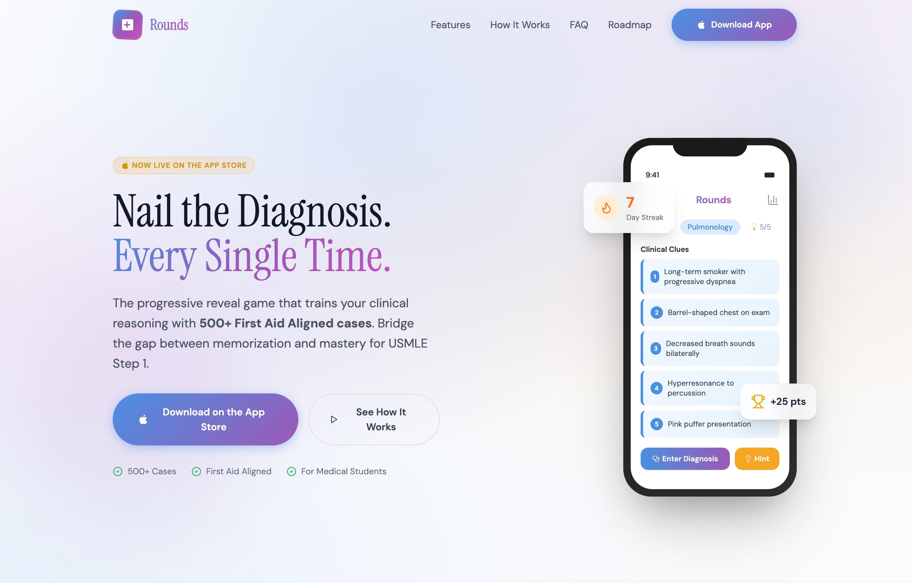
getrounds.app — the launch site
The Problem
Medical students don't need another place to store facts.
By the time a student is studying for Step 1, they already own the flashcard deck, the question bank, and the review book. What none of those teach is the thing the exam is actually testing: taking an incomplete picture and reasoning toward the diagnosis.
Rounds is a different format — clues arrive one at a time, and you decide when you know enough to commit. That's a genuinely new mechanic, which makes it a hard thing to sell. A new format has to be understood in about five seconds by someone who has already spent money on three other resources and assumes this is a fourth.
So the site had one job: make the format obvious, and make it look like something a serious student would be seen using.
The Approach
Sell the feeling of getting it right, then explain how.
The headline doesn't describe the product. Nail the Diagnosis. Every Single Time. is the outcome a student wants, said in their language. The explanation comes one line later, and it names the format plainly rather than dressing it up: the progressive reveal game that trains your clinical reasoning.
Credibility gets borrowed from things students already trust. First Aid alignment, a real case count, and the App Store badge do more work than any claim the site could make about itself — so they sit above the fold, in that order.
And rather than describing the loop, the page shows it: the hero image is a live case mid-reveal, five clues deep, with a streak counter and points visible at the edges. You understand the game before you read a word about it.
The Mechanic
A case is a decision, not a question.
Every case opens with a single clue. Read another and the picture sharpens, but the case is worth less. Commit early and you keep the points — the same tension a clinician feels ordering one more test before calling it.
That tension is the entire product, and it's why the format holds attention where a question bank doesn't. It's also why it belongs on the marketing site as something you can play, not something you read about.
That loop, rebuilt here on this page — real case, real scoring rule. Commit at one clue and the case is worth 50; ride it to five and it's worth 10.
Clinical clues
- 1Long-term smoker with progressive dyspnea
- 2
- 3
- 4
- 5
The System
Serious enough for medicine, light enough to play.
A high-contrast serif carries the headline — the register of a textbook, not a startup — while everything functional sits in a geometric sans that stays legible at case-text sizes on a phone.
Color is rationed. The blue-to-violet gradient appears only on the thing you're meant to press. Clinical content is always the same blue. Amber is reserved for reward — streaks, points, hints — so progress reads instantly, without a legend.
Ink
#111828
Case text, headlines
Signal blue
#5B85D9
Clues, clinical content
Violet
#9A59B5
Brand, gradient end
Streak amber
#F89B55
Points, streaks, hints
Clue surface
#EDF6FF
Revealed clue cards
Lavender
#E1E7F7
Page ground
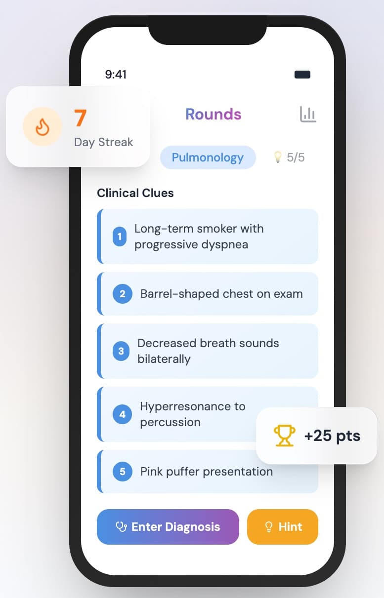
Clue stack, streak, and scoring — the loop in one screen
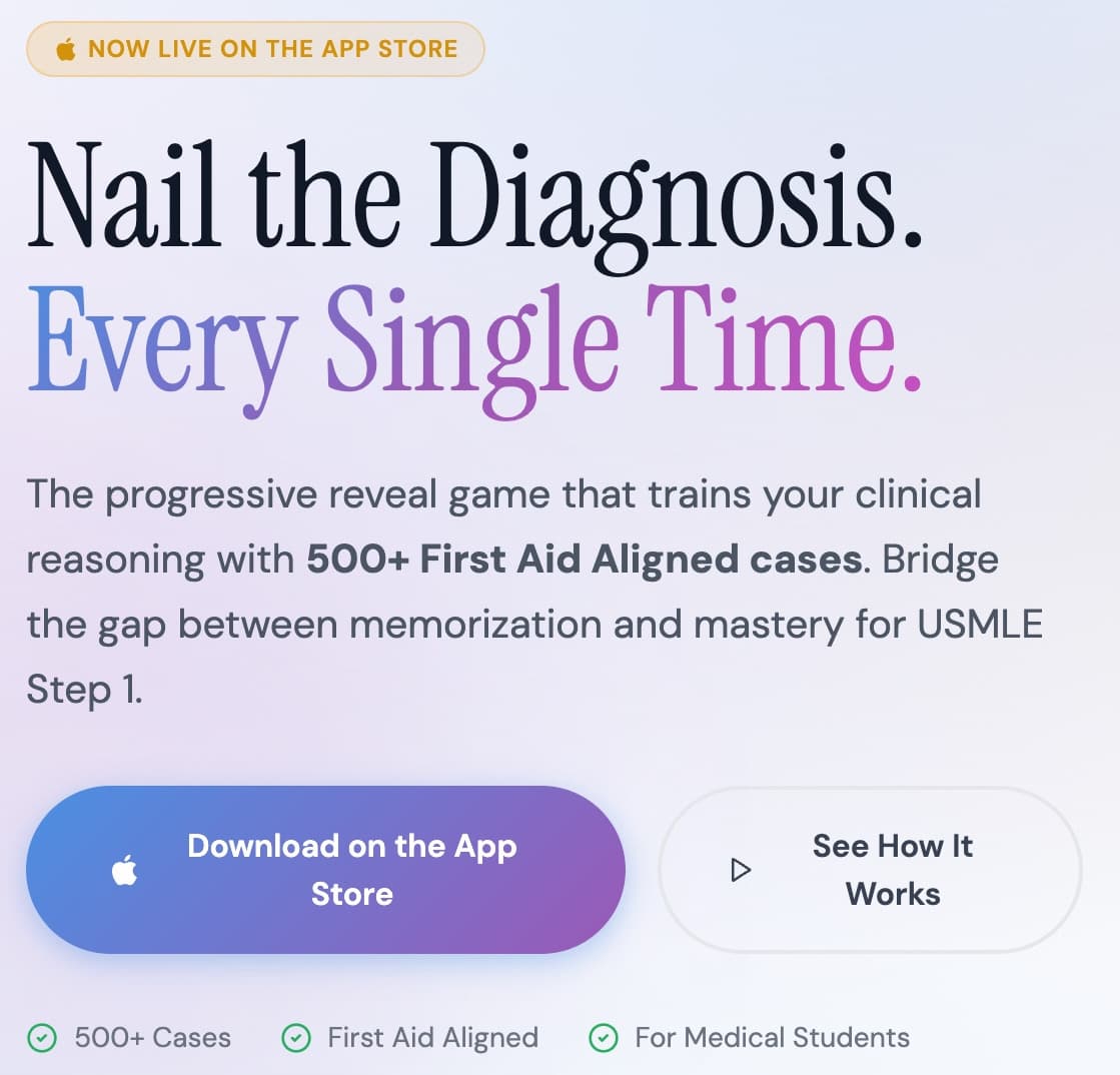
Above the fold
Five elements, in the order a skeptic needs them.
- 1Proof it's real — live on the App Store
- 2The outcome they want, in their language
- 3The format, named plainly in one sentence
- 4One primary action, one for the unconvinced
- 5Trust marks: case count, First Aid, audience
What Was Built
A launch surface that does the explaining.
The site carries the product's own interface language, so the step from page to App Store to first case never feels like three different products.
- Positioning and messaging for the launch
- Marketing site design and build
- Product story: hero, how-it-works, FAQ, roadmap
- Interface system carried from app to web
- App Store conversion path
- Responsive build, mobile-first
The Result
Live on the App Store, and in use at 40+ medical schools across the US.
A new study format only spreads if students can explain it to each other in one sentence. That sentence — the progressive reveal game for clinical reasoning — is now the product's own, and it carries from the site into the App Store listing and into the app itself without changing shape.
Next
If the format is new, the site has to teach it.