MD+
A 5,000-member community of physician-innovators had outgrown their website. We rebuilt everything — identity, infrastructure, and positioning — in two weeks.
Community size
5,000+
Delivery
2 weeks
Partners secured
Anthropic, Google, Abridge, a16z
The Problem
The website was the only thing holding them back.
MD+ started as a student-led community and became something rare: the only place where physicians, med students, and residents who are also interested in technology, consulting, VC, policy, AI, and data could actually find each other. Because it was the only community of its kind, it grew fast — past 5,000 members.
During that growth, leadership was focused on exactly what they should have been focused on: building the community, managing the organization, and responding to demand. The website was an afterthought — an early Squarespace site built quickly and scrappily in the beginning, just functional enough to host a Google form and a Slack link.
That was fine when they were a scrappy student org. It wasn't fine when they were a 5,000-member organization trying to secure institutional partnerships. The website wasn't just outdated. It was actively costing them credibility.
The Approach
The hardest part isn't designing the website. It's figuring out what the website is actually saying.
Ali started with a brand kit — colors, logo variations, font choices — to establish MD+'s visual identity from the ground up. But that was the easy part.
Brask Studio has learned, through doing this work, that unlocking real growth for a client requires something harder than design execution. It requires deeply understanding what their organization actually is, exactly what they do, who they do it for, and why that person should care. That synthesis has to come before any pixel is placed.
The inspiration here was closer to Rick Rubin than to a design framework — not about adding, but about reducing. Stripping an organization back to its essential elements until what remains is true.
For MD+, that reduction produced three things.
The Framework
These three became the spine of the site — what MD+ offers, in the order it matters. Once the structure was right, everything else followed.
Train
Equip members with new skills at the intersection of medicine and technology — workshops, courses, and hands-on programming.
Build Community
Social events, cohorts, and a living network that makes members feel they belong to something larger than themselves.
Legitimize
Formal institutional programs — the Catalyst program and Datathon — that give members real credentials and real weight.
Before & After
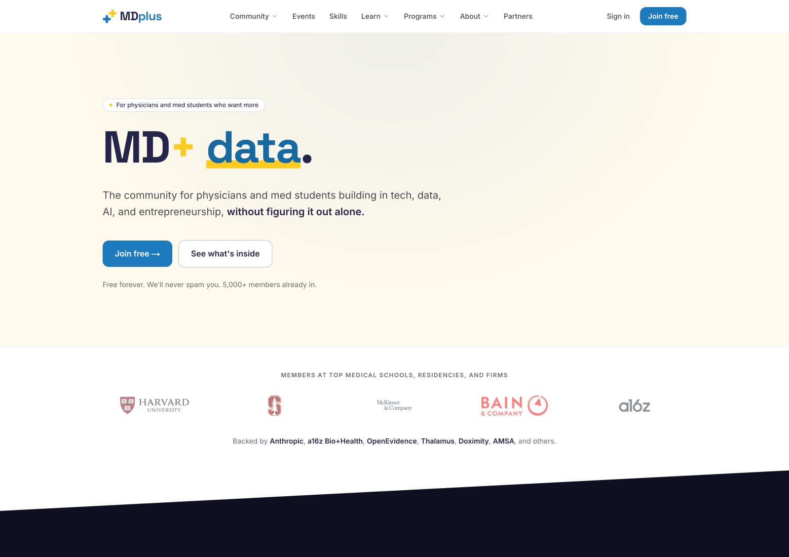
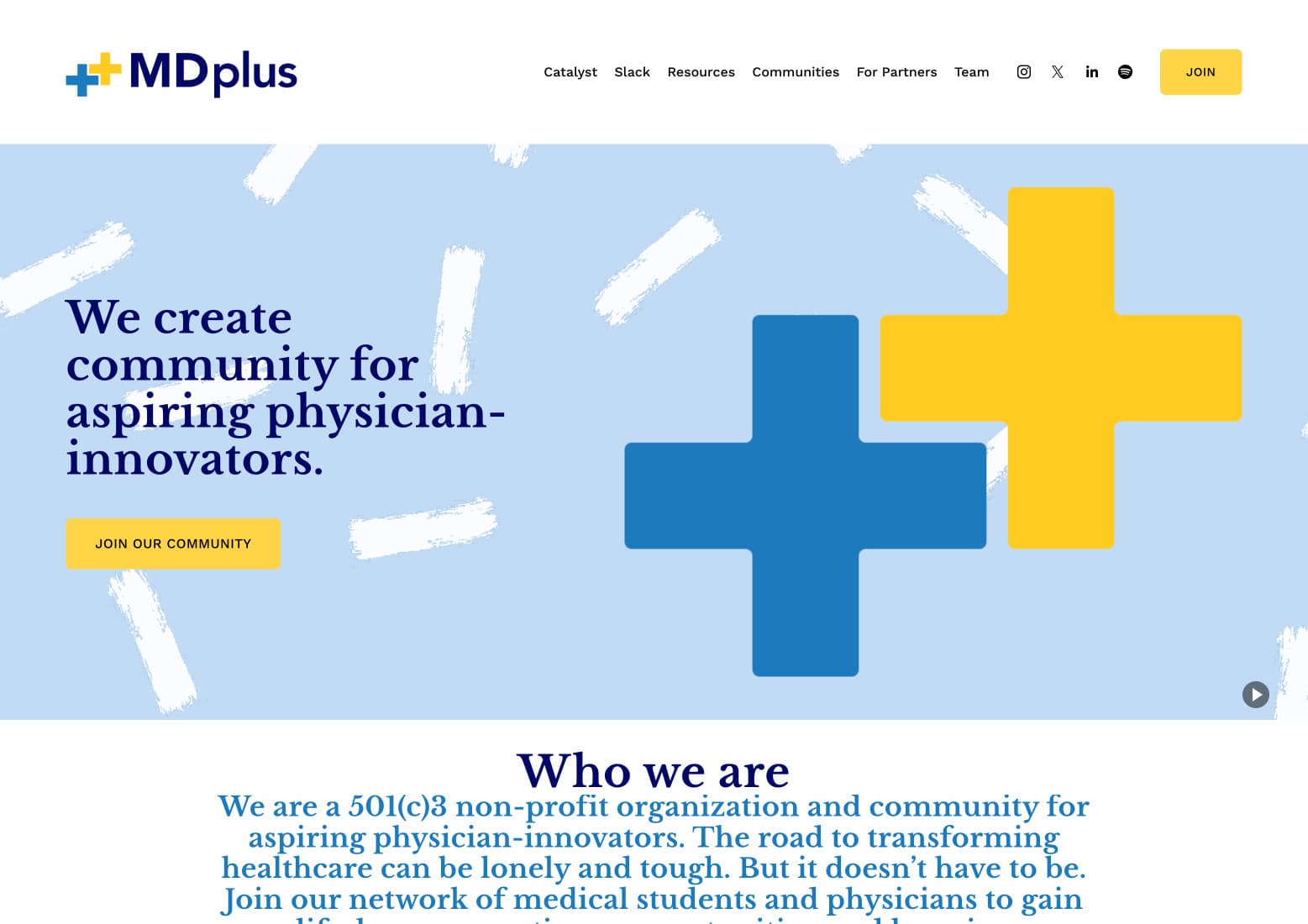
Before — Squarespace site built at founding
After — rebuilt in two weeks
Drag the handle
Same organization. Two very different arguments.
The old homepage led with a mission statement and a stock gesture toward community. Warm, but it could have been any student club.
The rebuild leads with who it is for and what they get — physicians and med students building in tech, data, AI — and puts the proof directly underneath: member institutions, named backers, and the size of the community.
What Was Built
Every part of their business, centralized in one place.
Within two weeks, the site was fully live — not just visually redesigned, but completely rebuilt with real infrastructure behind it.
- Brand kit: colors, typography, logo system
- Complete website redesign from scratch
- Login system and member authentication
- Content management system for blog publishing
- Spotify podcast integration
- Newsletter integration
- Centralized public-facing presence
- Admin infrastructure for back-end management
The Result
Shortly after launch, the partnerships followed.
The new website gave MD+ the institutional credibility their community had always deserved. With a platform that reflected the scale and seriousness of the organization, they were able to secure partnerships with some of the most significant companies in the world — quickly, and with more still coming.
The System
A brand kit is a set of decisions, not a set of swatches.
The old site had no system — colors arrived as they were needed. The rebuild starts from a fixed palette where every value has a job, which is what lets a volunteer-run organization keep the site consistent after handover.
Ink navy carries the wordmark and every headline. One blue means “this is an action.” The yellow is rationed to the plus itself and the occasional underline — an accent that only works because it is almost never used.
Ink navy
#25254B
Headlines, wordmark
MD+ blue
#176A9F
Links, primary action
Signal yellow
#FFCB21
The plus, emphasis
Cream
#FEF9EC
Hero ground
Slate
#494950
Body copy
Night
#0F0F22
Section breaks
Handover
- Logo system with usage rules
- Type scale for headings and body
- Component patterns for new pages
- CMS so the team publishes without a developer
The organization is volunteer-run and leadership changes. Anything that needs a designer to stay correct doesn't survive that.
Next
Your website should match what you've actually built.